
Case Study
Equals Money
Redefining Business Finance Through a Unified Platform
Project Overview
Role: Head of Product Design
Timeline: 20 months
Team: Designers grew from 2 to 4, 5 Product Owners, 3 Product Squads, CPO
Website: www.equalsmoney.com
Impact
- 84% H1 revenue growth (vs 2021)
- Unified platform launch across core B2B offerings
- Design scaled from 2 to 6 designers across squads
- White-label-ready architecture enabling partner expansion
- £15m monthly revenue supported by the platform as of March 2026
Equals Group set out to solve a fundamental issue: multiple, disconnected business offerings serving different audiences. Products such as international payments, expense management and faster payments had grown in isolation, limiting scalability and brand coherence.
The vision was ambitious: to unify all products into a single business account, positioning Equals as one of the few companies in the market capable of delivering a complete, multi-layered B2B financial suite.
Challenge
Each product operated on legacy technology, creating inconsistent experiences and limiting opportunities for cross-selling and integration. The business needed a universal platform that could support multi-currency accounts, expense cards and payments within a single interface.
Business objectives:
- Replace legacy systems with a unified solution
- Enable multi-currency and real-time balances
- Integrate accounting and payments
- Improve scalability and retention through a centralised experience
"We weren't just designing a product; we were redefining how Equals operates as a connected ecosystem."
My Role
As Head of Product Design, I led the design strategy and managed the design process across two squads. I worked closely with product and engineering to deliver the end-to-end experience while aligning with senior stakeholders, including the CPO.
A key focus was cultural transformation. Before this project, product, design and development worked largely in silos. I established cross-functional collaboration as the norm, ensuring design became the connecting force that united teams and accelerated delivery.
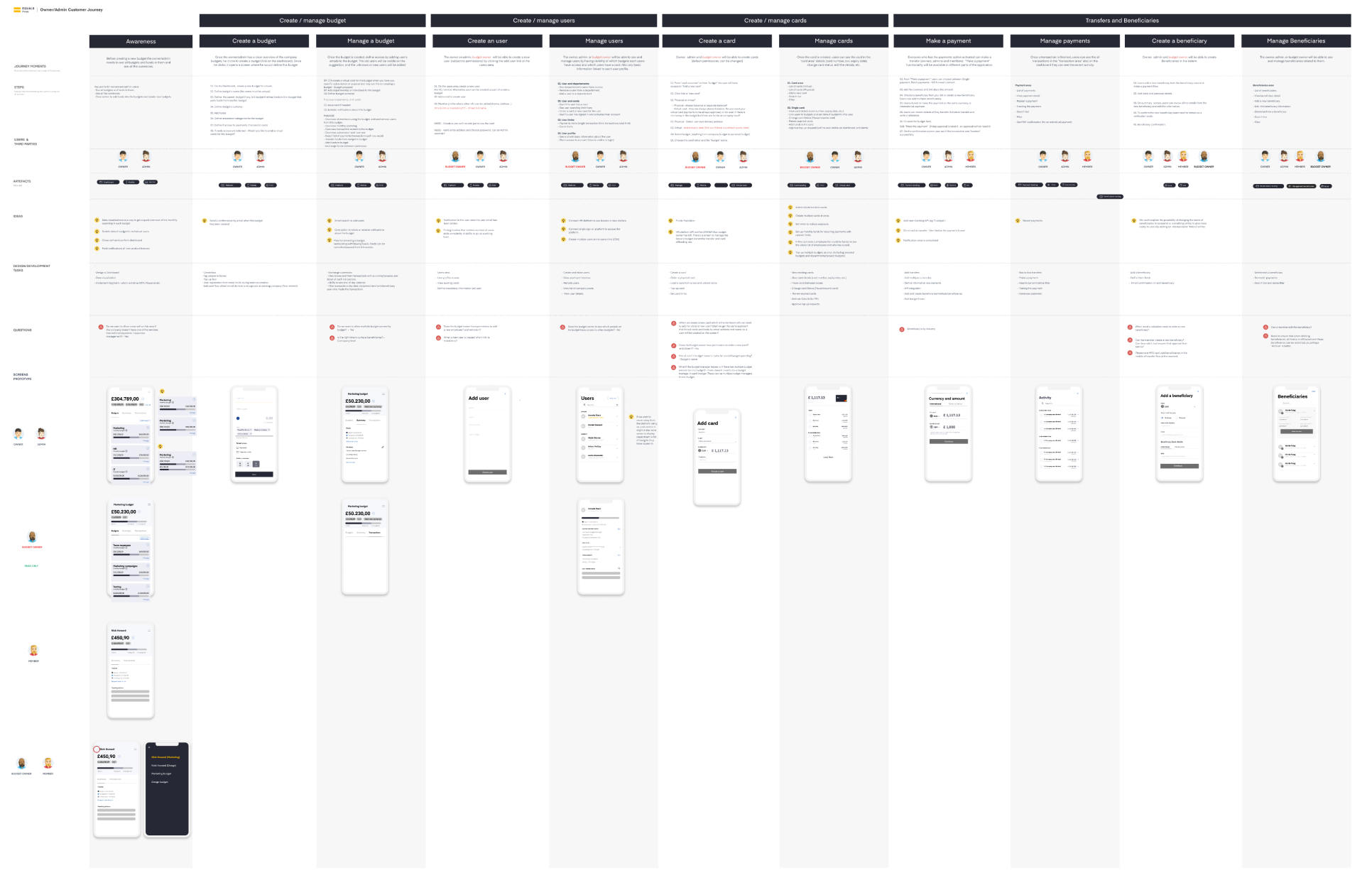
Planning the Design Roadmap
Before any design work started, I created a structured roadmap to plan how we would design, test and deliver each part of the product. This roadmap aligned design, product and engineering around shared milestones and dependencies, ensuring every team understood what needed to happen, when and why.
We began by defining core functionality across balances, user management, expense tracking, card management and integrations. These became the backbone of the roadmap. From there, I divided the work into clear categories:
- Must have: essential requirements such as multi-currency support, accessibility (AAA), light and dark mode, responsive layouts and scalability.
- Nice to have: features and refinements like quick feedback loops, data tracking and design-system-based improvements.
To bring clarity to sequencing, I led a two-week design sprint for each major product area. Each sprint involved:
- Aligning the team on goals and scope
- Running co-creation workshops to define solutions
- Prototyping and testing
- Refining and defining the final solution
We ran two squads in parallel, alternating their focus to maintain speed without sacrificing quality.
This structured, phased approach allowed us to progress rapidly while maintaining consistency across the entire product.


Research and Discovery
Before any design began, we invested heavily in understanding the market, the competition and the pain points within our existing ecosystem.
Our approach included:
- Benchmarking leading fintech platforms to identify whitespace opportunities
- Auditing existing Equals products
- Interviewing account managers and customer service teams to uncover recurring issues
- Mapping customer journeys to expose friction and duplication across systems
This phase produced a clear blueprint that informed both the architecture and the user experience, ensuring every design decision was grounded in evidence.
Establishing Design Principles
We defined a key guiding principle: "access at any point."
Every essential action, from funding an account to initiating a payment, needed to be instantly accessible wherever the user was in their journey. This shaped navigation, interaction logic and hierarchy across the platform.
We also built architectural maps detailing how balances interacted across businesses, departments, currencies and cards. This model became a shared reference for both design and engineering, creating alignment from the outset.

Building the Design Foundation
Before moving into UX flows, we established a robust Figma-based design system. This allowed us to move quickly and maintain consistency across hundreds of interfaces.
The design system:
- Enabled rapid, large-scale updates
- Supported both light and dark mode palettes
- Passed full accessibility testing
- Streamlined collaboration between squads
Although unconventional to prioritise UI before UX, it enabled high-quality delivery while maintaining flexibility as the product evolved.

Execution and Collaboration
We began by tackling two of the most complex features: multi-currency balances and account structures. I led workshops between design, product and engineering to define flows, dependencies and component behaviours.
To validate our work, we combined qualitative and quantitative methods:
- Moderated testing for key user journeys
- Unmoderated testing to refine micro-interactions and language
- FullStory analysis sessions to track behavioural data and identify unclear areas
This multi-layered validation process helped refine the product iteratively and strengthened confidence in our design decisions.

Cross-Functional Challenges
As the project progressed, design often moved faster than development, creating delivery challenges. I introduced structured documentation and frequent design development syncs to maintain alignment and ensure design intent was preserved.
This strengthened communication, built trust, and ensured quality was upheld without slowing progress.
Results and Ongoing Impact
Since launch, the product has had a measurable impact on the business. The company's stock value has continued to rise, and revenues grew by 84% between 2020 and 2022, highlighting the success of the unified platform and its contribution to commercial growth.
Key outcomes:
- Unified all B2B offerings into a single platform
- Significant reduction in user friction and operational complexity
- Growing interest from European and North American markets
- 84% growth in H1 revenues (vs 2021)
- Design formally recognised as a strategic function within the organisation
Building on this foundation, we moved into the second phase of development to evolve the product for white-label partnerships. The focus shifted to making the platform scalable and adaptable for external partners, extending the reach of Equals Money beyond direct customers and into new markets.

Reflection
This project redefined how I view design leadership. I'm most proud of how design became the glue that connected product, engineering and business, enabling collaboration, focus and clarity across the organisation.
If I could change one thing, I would push harder against legacy complexity during the UX phase. It was a valuable reminder that protecting simplicity early is key to achieving clarity at scale.
Key Takeaways
- Strong design systems enable quality, speed and consistency.
- Combining quantitative and qualitative insights creates more confident design decisions.
- Design can enable an organisation to move together with clarity and purpose.
Phase Two: Scaling the Product, the Platform and the Team
Role: Head of Product Design
Team: 6 Product Designers, 6 Product Squads
Timeline: Ongoing from 2022
Listening Before Building
After launch, we needed a short period to stabilise the platform and let teams settle into day-to-day use. Once that foundation was in place, we moved into a more structured customer-panel programme. Working closely across product, account management and other departments, we set up regular, conversational panels with customers from different segments, company sizes and verticals. Those sessions ran consistently over several months and became the core way we investigated how migration had actually landed in practice.
We asked how teams had adapted to the new platform, where they were losing time, what the gaps were, and what would make the biggest difference to how they operated. The output was a rich, evidence-led backlog of opportunities that would shape the product's direction for the next two years.
This phase set a precedent I have maintained ever since: design decisions at this scale should be earned through rigour, not assumed.
A Business Opportunity Becomes a Design Catalyst
At the same time, the business was responding to market demand. Inbound interest was growing from other companies wanting to offer financial services under their own brand, creating a clear commercial case for white-labelling the platform.
This was not just a technical challenge. It required rethinking the design system at a foundational level: tokenising colour and typography, abstracting brand identity from structural logic, and building theming capabilities that could flex without breaking consistency. The engineering team needed to refactor how the system was built, and we used that window to do the same in design.
Rather than treating this as a parallel workstream, I made the case to align both efforts. The white-label refactor became the scaffold on which we layered the improvements identified through customer research, a rare opportunity to improve the product structurally and experientially at the same time.
A critical enabler throughout this phase was sustained investment in the design system. I consistently advocated for this at organisational level and built the business case for protecting capacity through a dedicated Design System and White-Labelling squad. That squad gave us the strategic space to continuously refactor and strengthen the system while helping all product squads stay aligned on shared UX patterns, solve problems more coherently, and scale quality without fragmenting the experience.
The scope of this combined initiative included accessibility gains across the board, with keyboard navigation as a priority, along with a series of UX optimisations that would make the platform more powerful for the growing complexity of our customers' operations.
Key Feature Areas
Custom Views: One of the clearest signals from customer research was that different users, finance leads, team managers, operations staff, needed to see the world differently. Transaction lists, approval queues and activity feeds were being used in ways we had not fully anticipated. We designed a custom views system that allowed users to define, filter and save their own configurations across the application. Alongside this, we rebuilt the filtering architecture entirely, replacing rigid dropdowns with a composable, scalable filter system informed by the interaction patterns of tools like Notion and Linear. The result was a more intuitive, faster and far more flexible way to navigate data at any scale.
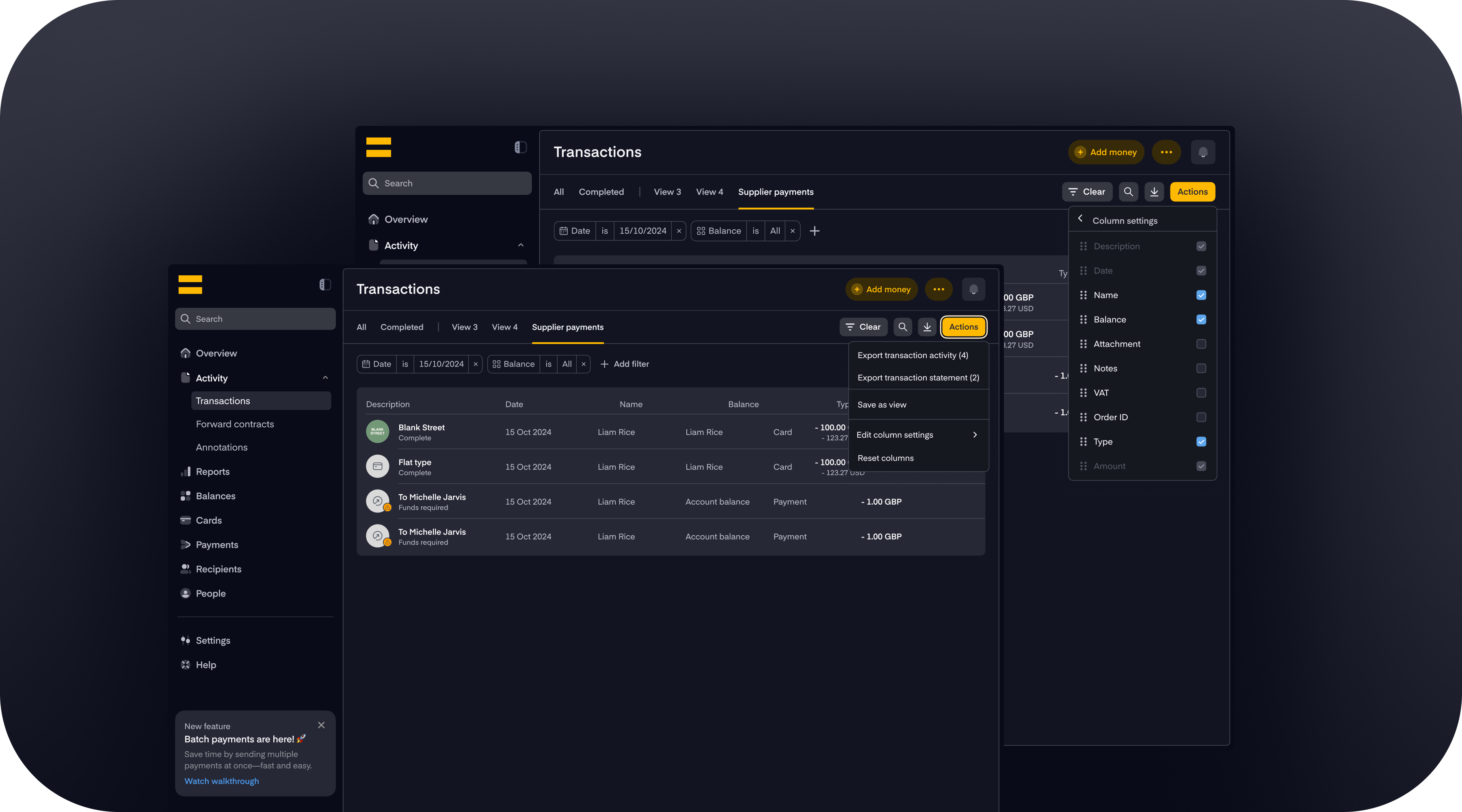
Payment Flow Optimisation: Payments remained the most business-critical flow in the platform. Through a combination of FullStory analysis, usability testing and the introduction of new payment methods, we identified and removed key points of friction in the journey. We also restructured the flow to accommodate new payment types without increasing cognitive load, a challenge that required close collaboration with engineering to ensure the experience held up at the technical layer too.
Navigation Restructure: As the product grew, the navigation had not kept pace. New features had been added incrementally and the information architecture had started to fracture. I led a multi-round rearchitecting of the application's navigation structure, running card sorting sessions, tree testing and iterative prototype reviews with real users. We went through several significant evolutions before arriving at a structure that could accommodate what existed today and scale for what was coming next.
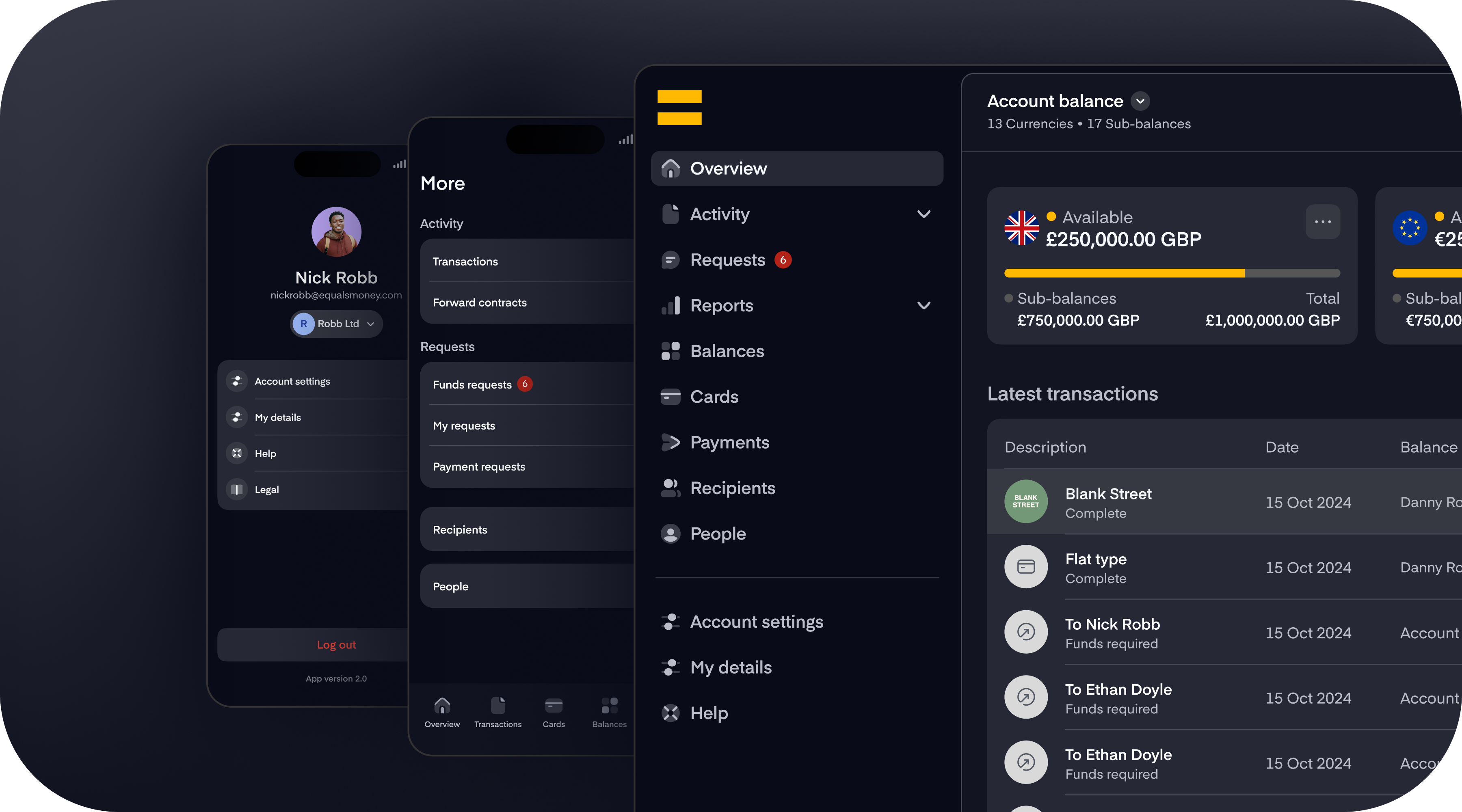
Settings at Scale: The settings section of the application had grown substantially as new capabilities were introduced. What had once been a simple configuration space had become a complex area managing permissions, integrations, team hierarchies and platform preferences. We redesigned this area from the ground up, bringing clarity and hierarchy to an increasingly dense part of the product.
Bulk Actions: Feedback from larger enterprise customers made it clear that one-to-one operations were not enough. Admin teams managing large organisations needed to annotate, assign, approve and action at scale. We designed a bulk actions system that gave power users the efficiency they needed without disrupting the experience for smaller teams who did not require it.
Growing the Team, Evolving My Role
What started as a project I shaped almost solo, supported by one other designer, has grown into a team of six product designers operating across six product squads. That transition did not happen by accident; it required deliberate work on how we were organised, how we shared knowledge and how we made decisions together.
As the team scaled, I shifted progressively from being hands-on in the work to being the person who made the work possible. That meant establishing design principles and critique practices that kept quality high across squads without creating bottlenecks. It meant advocating for design in planning and strategy conversations so that the team's capacity was protected and well-directed. It meant building a culture where designers felt ownership over their areas and the confidence to lead cross-functional conversations themselves.
The moment I felt most clearly that we had built something real was when I realised the team no longer needed me in every room. They had internalised the standards, the way of thinking and the collaborative instincts we had built together. My role became one of direction, not execution, and that is where I believe design leadership creates the most durable value.
What This Phase Taught Me
This period confirmed something I had suspected but not yet fully tested: the most important design decisions are not always about the interface. They are about structure, what you build, when, in what order and with whom. The white-label initiative, the customer research programme and the team reorganisation were all design challenges as much as they were product or business ones.
What makes me most proud is where this product stands today. From a blank canvas in 2020, we have built a platform that now sits at the heart of a business generating £15 million in monthly revenue. That growth did not happen despite design; it happened with design at the centre of every major decision. To see what started as a single concept, developed by two designers, become the core engine of a platform strong and scalable enough to be licensed by other businesses offering their own financial services, that is the measure of foundations built well and a team that grew into something truly exceptional.
Key takeaways from Phase Two
- Sustained research programmes surface the right problems, not just the obvious ones.
- Aligning business initiatives with design improvement cycles creates leverage that neither could achieve alone.
- Scaling a design team is itself a design problem: it requires the same care, iteration and craft as any product.
- Leadership matures when you invest in the people around you as much as in the work itself.