
Case Study
FairFX Migration
Migrating 70,000 Customers To A Multi-Currency Platform
Project Overview
Role: Product Designer (End-to-End Ownership)
Timeline: 2 months
Team: 1 Designer, 8 Developers, Performance Marketing, Customer Services
Website: www.fairfx.com
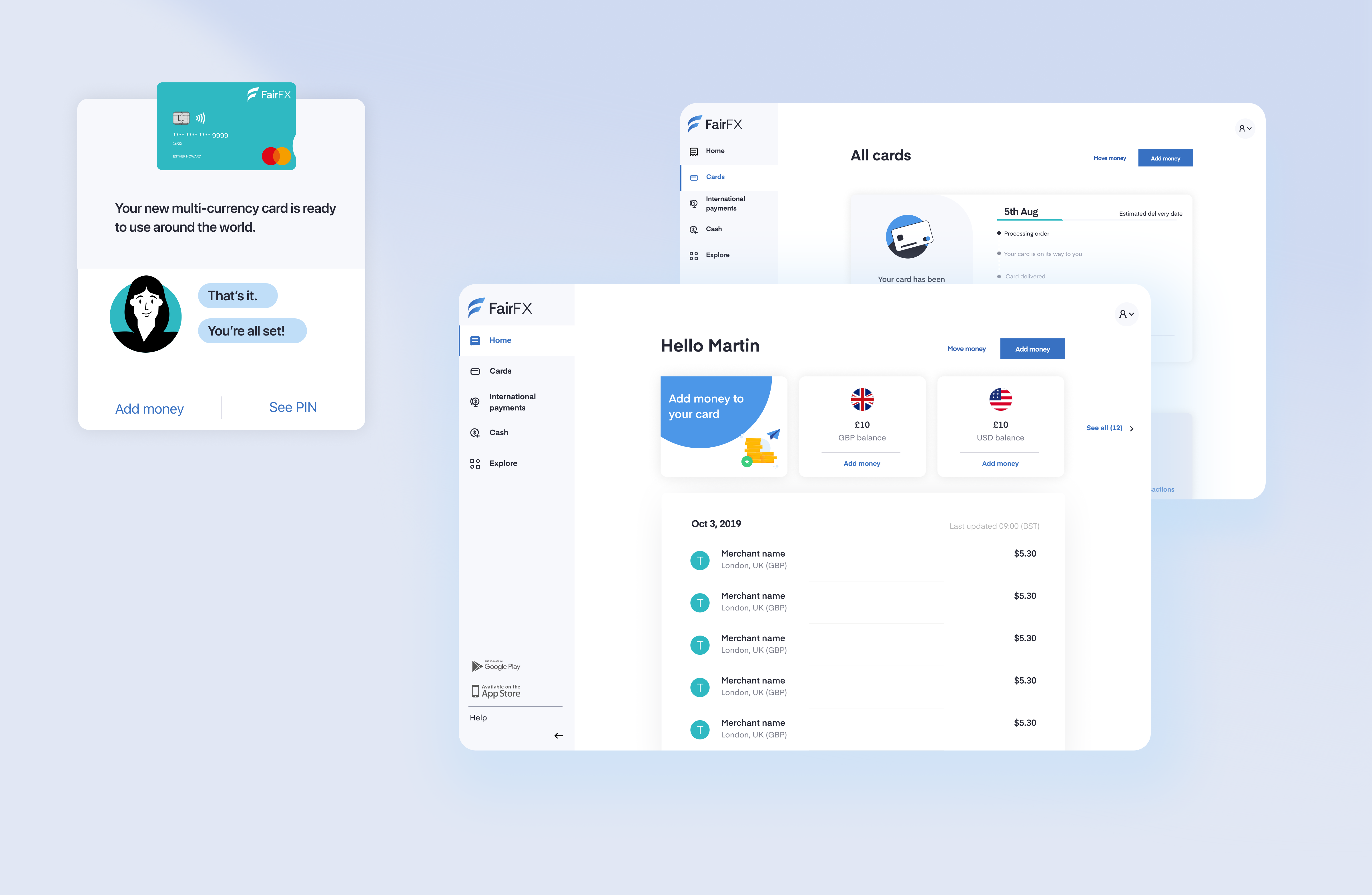
FairFX faced a major challenge: migrating over £12 million and 70,000 customers from three single-currency cards (USD, GBP and EUR) to a new multi-currency system. The new platform also needed to support joint account and card usage across a range of scenarios from families and partners to household help.
All of this had to happen in less than two months, during a rebrand and in the middle of the Covid-19 pandemic.
Challenge
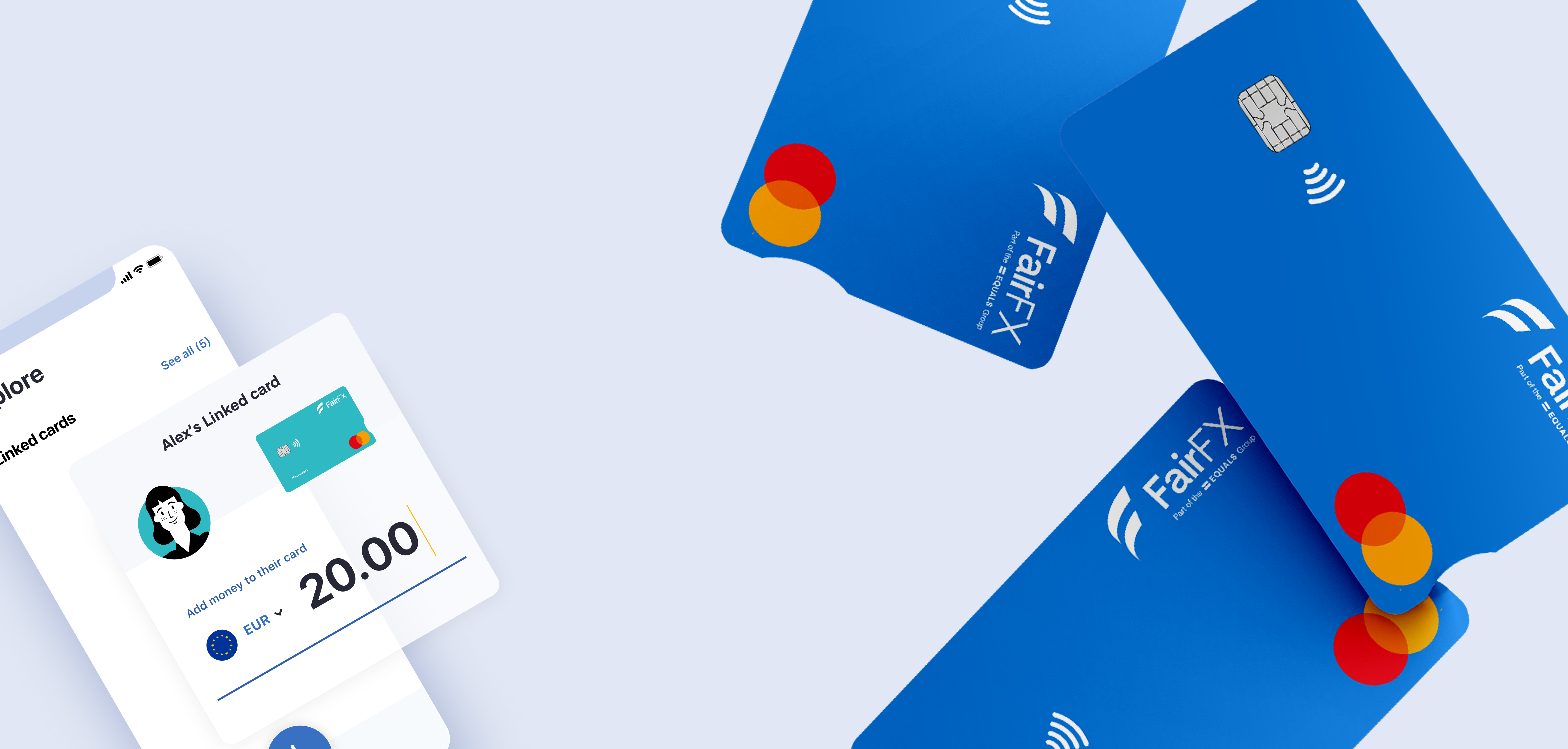
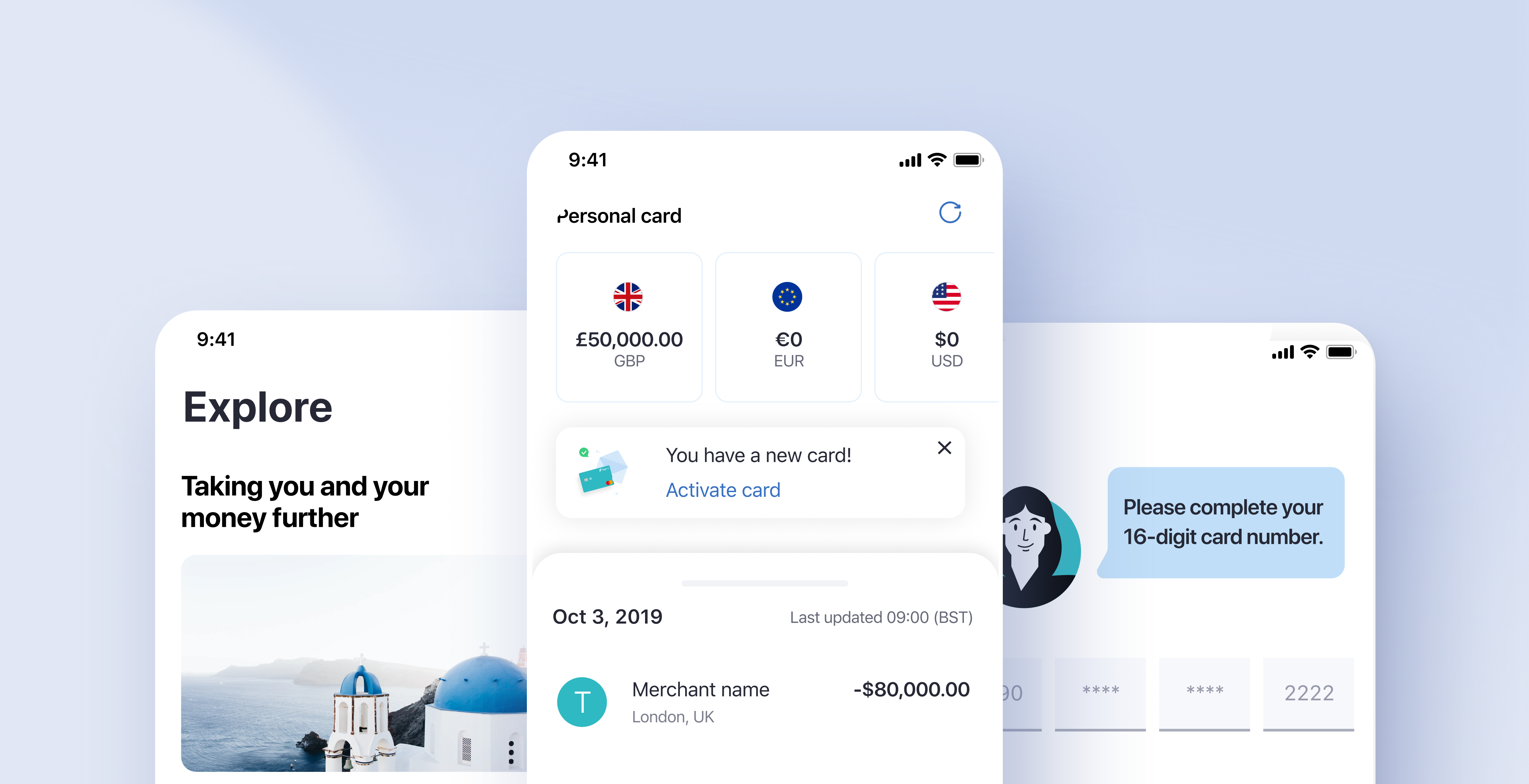
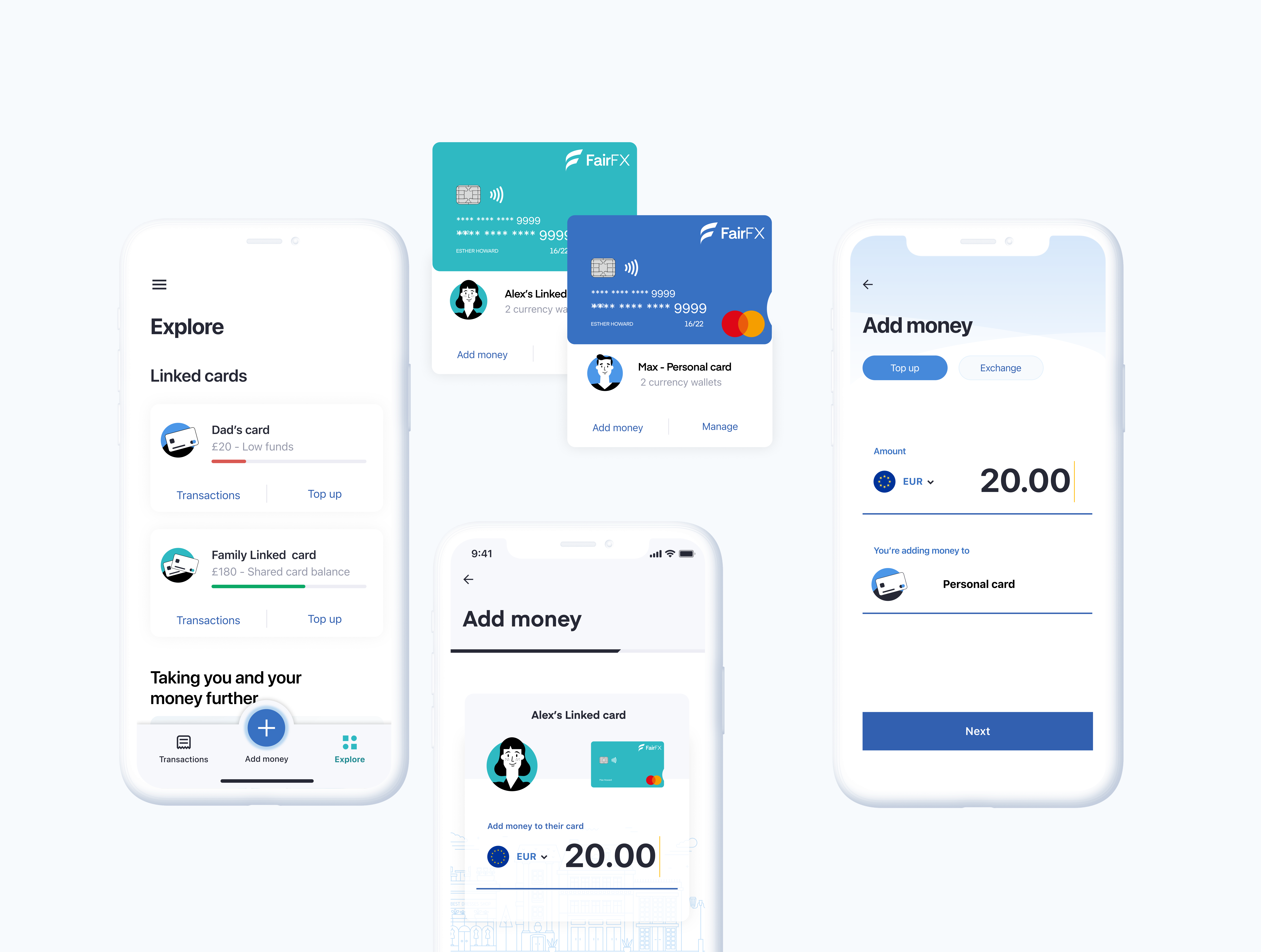
The business needed to move away from its legacy single-currency products and deliver a new multi-currency experience capable of managing up to 12 cards per account. Each card could be assigned to different users, while the main account holder maintained full control.
In addition to this, the product needed to integrate with other FairFX services such as cash delivery, international transfers and cashback, enabling future cross-sell opportunities.
Objectives:
- Seamlessly migrate customers and funds to a new multi-currency system
- Deliver two new products: a native app and a responsive web app
- Create a flexible, scalable foundation for growth
- Reinforce brand consistency through the rebrand rollout
"This was one of the most complex design and migration challenges we'd ever faced. Two months to rebuild a product, rebrand a company, and retain the trust of 70,000 customers."
My Role
I was the sole designer responsible for the entire product design process, from discovery through to final delivery. This included setting the visual direction, defining UX and UI standards, influencing brand and colour choices, and even working directly with Mastercard to produce coloured printed cards that solved real UX problems around card differentiation.
I worked incredibly closely with the lead developer, often jumping on weekend calls to fine-tune the product details. Together we made sure the experience felt crafted, intuitive and polished.
Research And Information Gathering
Before the first kick-off session, I partnered with the performance marketing team to gather and interpret data that would shape our approach.
Despite tracking limitations in the old system, we uncovered key insights:
- 96% of users were only using the product to manage their currency cards
- 65% of users primarily accessed the product via mobile rather than desktop
This data guided a mobile-first strategy focused on multi-currency management instead of simple card administration.
I also audited the existing Equals Go and FairFX products to identify technical limitations and opportunities. Because the new system was being built on top of Equals Go's technology, understanding its architecture and pain points was essential.
Workshops And UX Brainstorming
With teams working remotely due to the pandemic, I facilitated collaborative workshops via Zoom and Figma, ensuring every stakeholder had visibility and input.
Workshop goals:
- Map existing journeys and identify blockers
- Define and prioritise MVP features
- Benchmark against leading fintech experiences
Through these sessions, we identified three potential directions for the product:
- Card-centred (mirroring the legacy app)
- Currency-focused (emphasising multi-currency management)
- Single-currency workflow (simple, minimal model)
We aligned on the currency-focused approach, as it best supported the migration goals and user needs.

Solving The Multi-Currency And Multi-Card Problem
One of the most complex UX challenges was combining multi-currency functionality with multi-card ownership. At the time, even major players such as Revolut hadn't fully solved this interaction problem.
I designed a flexible system where users could easily view, top-up and transfer between currencies across multiple cards and account holders, without introducing friction or confusion. This required deep collaboration with engineering to create clear mental models, intelligent grouping and consistent visibility at every level of the experience.
Prototyping And User Testing
Using the Geometry design system, I built high-fidelity prototypes quickly and efficiently, allowing development to progress in parallel.
We ran remote user testing using UserZoom Go, combining qualitative interviews with task-based feedback.
One memorable design decision was the introduction of a large '+' top-up button. Initially controversial internally, but it performed strongly with users and became a key interaction feature in the final product.
Delivery And Problem Solving
Within four weeks we had two MVPs ready: a native mobile app and a responsive web app, plus a migration flow for all customers.
The beta launch coincided with the unexpected insolvency of Wirecard, forcing an immediate full-scale migration. Working in real time with the customer services team, we triaged bugs and prioritised fixes daily.
For example, the absence of live exchange rates in the MVP quickly surfaced as a high-priority issue, which we addressed immediately. To manage user feedback effectively, I partnered with marketing to distribute focused surveys and identify genuine, high-impact issues.
Once the system stabilised, we rolled out additional features including Linked Cards, cash orders, international payments and cashback integration.

Reflection
This project taught me the importance of owning the outcome: every decision, every success and every mistake. As the only designer, I had to lead not only the design process but also its communication, rationale and impact across the entire organisation.
Working so closely with engineering gave me a deeper appreciation for shared ownership and accountability. It also reinforced a vital leadership lesson: speed must never compromise clarity, and design integrity is everyone's responsibility.
Key Takeaways
- Owning the full product design process enables strong, consistent decision-making.
- Collaboration between design and development creates real craft and precision.
- Complex multi-currency and multi-card experiences require clarity and logic above all else.
- Large-scale migrations succeed when communication is transparent and continuous.
- Taking full responsibility for the outcome, positive or negative, is where true design leadership begins.